Cateran
Elite Member
http://www.ohlinsnews.com/current-issue/cafe-31.html
Another Duc Cafe racer for slagging/admiration...................
Another Duc Cafe racer for slagging/admiration...................



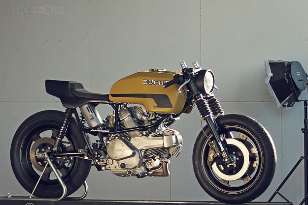
Too much gold...


looks like it has manipulated time so much that retro has become futuristic
Sorry but I'm going to disagree with everyone - I like it (the first one)
I think the gold works. The large flake paint looks really 70s and complements styling of the bike.
The seat is too skinny and would look better if it was more substantial. The Monster tail-piece mounted at a slight angle ties in nicely but would work better if the handle covers were shaved.
.
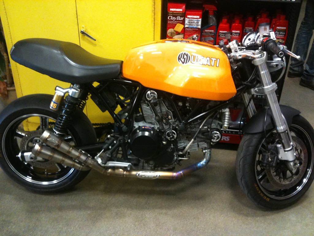
I don't like the second one at all.


Absolutely. but not on the 2nd one - sorryWould you be seen on the first one ?
Absolutely. but not on the 2nd one - sorry
 Really Graeme well you'll no be oot wie me if yer on it
  uke:
uke:


Don't take it out in the rain.
I view Motorcycles as to be ridden


 Is this a compliment or criticism?